Convex Digital
Crafting an intuitive and engaging experience to help marketers increase the ROI of their online brands.

Btw, took this product from 0 ➡️ 1
MY ROLE
MY TEAM
Prioritized features,
conducted competitive analysis, defined information architecture and visual language, and conducted user testing.
2 Designers (Including me)
1 Product Manager
1 Business Analyst
3 Developers
2 Quality Analysts
1 Chief of Marketing
DURATION
8 Weeks,
worked in sprints of 15 days
TOOLS
Sketch, Zeplin, Invision, Miro, Google Sheets
CONTEXT
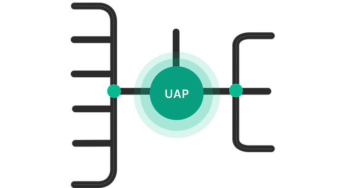
Convex Digital's
Unified Audience Platform
The Unified Audience Platform assures there are no more silos of data. No chaos on who the customer is or how to best engage with them. With this platform, marketers can create the right automation, make suitable recommendations.
The problem
Marketers are often confused about what action to take on the data generated by multiple sources, and how to help them achieve a significant ROI with fewer efforts.
Many marketers complain that the data stack did not speak for itself, and it was difficult to transfer the insights gained from one platform onto another. They also were concerned about customer retention and targeted marketing without overspending on social media ads.
The solution
A platform that provides marketers with a simple experience for synthesizing data coming from different platforms that will help them execute a customized marketing plan for every type of customer using filters and segments.
.png)
Quick glimpse of the platform
1
Tool Integration
During the setup of the platform, different tools can be integrated easily, without any code. Users can search, or filter out from the categories, to choose the best stack for the website.
Segment Creation
3
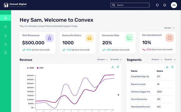
Dashboard
UAP dashboard and analytics reveal the kind of actionable segment insights that help you drive more sales, more consistently. Understand the revenue and performance of your campaigns and strategies in real time - from revenue attribution, to who your most loyal customers are, and beyond.
5
Customer Profile
One of the core features of UAP is to merge details from multiple data sources. UAP aggregates user IDs when multiple apps, such as HubSpot, Intercom, Metrilo, etc., are connected and create one single master profile. It also automatically maps session details.

2
The segmentation lets users dive deep into who the customers are and how they shop, and serve up dynamically personalized content that speaks to individuals. Users can create these using various filters and boolean functions. It also updates real time, allowing users to effectively target all the customers with flawless precision and timing.

4
User List
User list that is segrated by visitors, identified and customers. Segments can be created by selecting users from the list or can be filtered. There is also a provision to view similar types of visitors. Bulk actions such as edit, delete, download, and adding tags can be done in this section.


How did I get to the solution though?
Ground Work
Being completely new to this domain, I interacted with marketing experts to understand the current processes, basic terminologies, and how unified audience platforms contribute to marketing strategies.
Competitive Analysis
Competitive Analysis was conducted to understand the key features, user flows, and how/if these platforms are leveraging UX patterns to make the experience smoother for marketers. Along with that, I read online reviews for each of the platforms.


Feature Comparison
.png)
Most of the competitors did not have the ability of segment creation, which is an important feature to track similar users and apply automation. They only provided the ability to filter users.
None of the platforms had team onboarding; with this feature, you wouldn’t need other platforms to communicate, not an MVP feature though
Only Metrilo provides a detailed session view; others state the session's outcome.
Feature Prioritization
I facilitated a session with the design lead, product manager, and Chief of Marketing to prioritize the features by applying the Moscow rule. These features were derived from background research and competitor analysis. Decisions were documented to help all the teams be on the same page.


Listed down all the possible categories of information that can be captured
Also noted the type of information that would be under every category
Applied these filters by discussing it with the team
Added the notes from our discussions
Key Features
The following are the key features that were finalized:

Tool Integration
Introducing during the onboarding to help users add their marketing stack to the platform.

User Segments
Ability to categorize users into different static/dynamic segments based on the events, actions and activity.

User Lists
List of the users segregated into customers, identified and visitors.

Customer Profile
A screen with detailed information about the customer's sessions, sources and engagement
User Flow
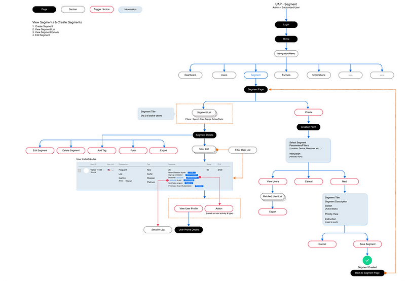
Considering this was a zero-to-one product, I had to pay attention to user flows and ensure the steps were natural and inspired by the users' mental models. I created few versions of the flow, which were discussed with the design lead and the product managers. The one below represents the critical flow, which is segment creation.
Paper Wireframes
I took inspiration from our competitors and layed out elements on paper to quickly sketch out multiple options for the platform's structure.
Main decisions that were made at this stage:
1
Having side navigation will allow users to easily navigate between multiple sections.
2
The customer profile will be divided into two sections to allow the marketers to view the sessions and user details side by side.
3
User lists will have tabs, which will help marketers easily switch between customers, visitors, and identified users.


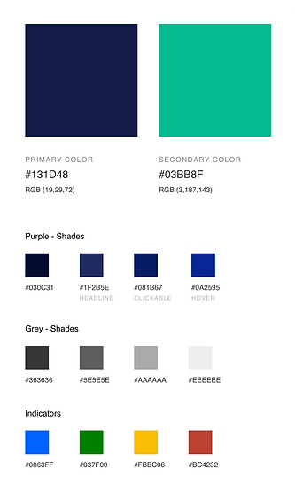
Style Guide
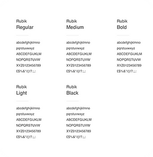
To aid other designers in maintaining the platform's visual language's coherence, I prepared a style guide with primary colors, secondary colors, font hierarchies, and button styling.


Early Iteration, User Insights & Final Designs
Based on the wireframes, I created the first version of the UI Designs. Followed by that I moderated a remote usability testing session with 6 users to identify grey areas in the designs.
Tool Integration
Initial Design
.png)
1
2
3
4
Key Insights
“It was very easy to find tools through this navigation”
“The onboarding process was super easy, I can do it on my own and don’t need help of a developer”
“I love how all the tools are available, I don’t have to change my stack.”
“Can do all the steps in one screen?”
This insight was not considered as it will increase the cognitive load.
Segment Creation
Initial Design
.png)
1
2
3
4
Key Insights
“This list is good, the number of users and time mentioned, helps to get quick insights”
“The form is good, but the would like more detailed filters”
“I want to see what kind of existing users might go into the segment.”
“It’s kind of confusing for me that the form and list is side by side.”
This was a repetitive comment, and definitely needed to be considered
%202.png)
Final Design
Segment list and creation were divided into two screens, as it was confusing to the user, we also added tabs to sort different segment in the list. We also added more detailed filters to create a very targeted segment based on the events performed.
Tabs
Detailed filters
.png)
Opens up a user listing
Boolean Filters
Dashboard
Initial Design

1
2
3
4
5
Key Insights
“Would love to see an overview”
“This is very useful”
“Need to know my main customers here.”
“Love the compare feature of the revenue widget”
“Want the option to download and share each widget”
Final Design

The revised dashboard provides a quick overview of different KPIs at the top. The users were also interested in knowing their valuable customers and the new customers generated. It also lets users download or share the CSV files of the data on every widget.
KPI
Overview
Share and download
data from each widget
Widget to view customers with major contribution to the revenue
User List
Initial Design

1
2
3
4
5
%202.png)
Key Insights
“This is confusing”
“Want to see similar visitors, if any”
“I want to see engagment here and be able to sort accordingly”
“Can we have bulk actions here? That would be cool.”
“Also, put the filters similar to what we discussed in the segments section”
Final Design

Engagement & scores were introduced, and the sort by options were made more straightforward. After selecting several users, bulk actions are also enabled. We also included more filters, such as events, tags, and actions, to get a more targeted list.

more filters
sort by
Engagement
& Scores
Bulk actions
An option to find similar visitors
Initial Design
Customer Profile

1
2
3
4
Key Insights
“Love this, quick insights are wonderful”
“Want a time range here, for when there are alot of sessions”
“Need the ability to edit the whole profile”
“I would want to see the latest session first.”

favourite icon
Final Design
The most recent session was shown at the top to make it easier for marketers to take action. We also introduced tags to the details section. In addition, the entire profile has an "edit" option. To maintain tabs on a particular profile's actions, it can also be marked as a favorite.
%201.png)
%202.png)
Assigned
tags

edit action
expand
session
Success Stories ⚡️
Unified Audience Platform was used by certain companies, here are the success stories of two of them -
.png)
.png)
Thanks for reading! 😁
Check out my other projects


Redefining Travel and Expense Management

School Vehicle Tracking Application